Quick HCP title hack with the Navigation Manager
One of the great things about the new SAP is that it has embraced open standards and protocols, and is building the UX and UI present and future on HTML5. A by-product of that is the ability to see how they’re building things and make, or suggest, changes.
At SAP Inside Track Sheffield last year, one of the sessions I gave was “Fixing up a nicer HCP Destinations table”, where I showed the power of UI5 introspection and the Chrome Developer Tools that enabled us to modify the surface upon which we were standing, to improve things. I re-recorded my session as a video here, in case you’re interested:
Fixing the HCP cockpit titles
Anyway, there’s something else that’s been niggling me a bit while using the HANA Cloud Platform (HCP) cockpit. And that’s the inability to see which tabs in my Chrome browser are open at what particular areas of the cockpit. Due to the way each location’s title text is structured, all the tabs look the same – at least at the start. It’s only when you hover over them you see what a given tab contains.
Here’s an example:

It’s only when hovering over the first tab that I see that it’s showing the HTML5 Applications part of the cockpit. If I’m looking to switch to that tab, the search for the correct one is painful.
So I wanted to take a quick look to see where this title was being set, and when. I used the Chrome Developer Tools’ DOM breakpoints feature to halt when the title element was changed:

This led me to a section of the HCP cockpit code that inside the Navigation Manager (cockpit.core.navigation.NavigationManager), in a function called “navigate”. This is what the code that sets the title looks like (I took the liberty of formatting it a little bit better for readability):

You can see how the title string is constructed – with the most significant part (current.navigationEntry.getTitle()) buried deep within it.
A small change to this code, so it looks like this:

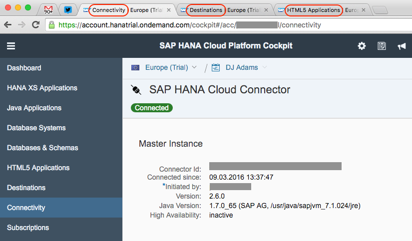
brings the most significant part to the front, meaning that now I can see what tab contains what HCP cockpit feature – at a glance:

I think that’s a nice improvement. Personally, I’d love to see this make it into a future release. What do you think?