User Notifications with the Message Popover
30 Days of UI5 - day 8 by Sean Campbell.
(Get to all the parts in this series via the series post.)
Giving an end user good feedback regarding their interaction with the application or the application’s interactions with the back end has always been a bit of a challenge in UI5. Until recently pretty much every developer had a different style of capturing and exposing messages, with many of us building our own message log solutions. This lost a level of the “Enterprise” uniformity that is often required for our applications.
In recent releases however SAP and OpenUI5 have provided a very robust and uniformed way of exposing these messages.
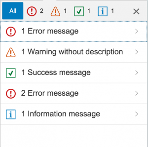
Now users can expect message to be shown in a clear and concise way, that is the same across all UI5 applications; no more are we hacking around arrays to provide our own message logs. From the bright colours to the simple click through to view a more detailed message, everything about this control has been aimed at the user who expects clear interactions, even Web Dynpro Java (WDJ) handled messages better than early UI5.
In the example below I have mocked up a couple of Buttons that trigger the Popover in its two “States”. I tend to lean towards the full Popover as its easy to see a full list of the most recent messages. However I can see good use cases, in mobile apps for example, where the condensed popover would be best. As shown in Day 3 of this series, on Semantic Pages, the footer bar makes a nice place for the Button that controls the Popover.
This control still isn’t perfect and there are a number of improvements I could see being added over the next few iterations but it is certainly a dramatic leap in the right direction for UI5 and user interaction. The ability to easily delete messages would be nice along with a way to prevent duplication on error.
A nice touch that can be done relatively simply is to alter the look and feel of the Button dependent upon the level of messages that have been posted. Those that have been following this series will have read DJ’s post on Expression Binding from Day 2 of this series. This would be a great way to derive the icon in the Button, to be based upon the “Highest” status message. Doing this gives the user feedback without them even opening the Message Popover and to me giving a user feedback at the earliest possible time is always going to give them the best experience.
- ← Previous
The App Descriptor - Next →
Bootstrapping UI5 Locally and in the Cloud