Semantic Pages
30 Days of UI5 - day 3 by DJ Adams.
(Get to all the parts in this series via the series post.)
(This book was a close companion in an earlier life.)
My degree in Latin and Greek is not entirely without foundation or reason, and it provides me with at least a small sense of origin when it comes to words. The 3rd declension noun σῆμα conveys the idea of a mark, a sign, a token. It refers to “meaning”, essentially, and the use in modern languages of the word semantic often implies an abstraction, a layer that confers or allows meaning to be defined or carried.
What has that got to do with UI5 reaching release 1.30? Well, take a look at the fledgling Semantic Page. It’s the root of a series of new controls that are perhaps set to encourage standardisation of Fiori UIs. The SAP Fiori Design Guidelines describe a rich set of controls, but more importantly they describe how those controls should be typically employed.
Floorplans such as the Split Screen Layout and the Full Screen are all fairly familiar to us. But consistency comes from attention to a more granular level of detail, and the UI designers are encouraged to place certain controls in standard places. A couple of examples: Action buttons belong in the bottom right (in the footer) of a page, while the new Message Popover from 1.28 belongs in the bottom left.
When SAP created Fiori application developer teams across the world to build out the Fiori apps that we see available today, it was almost inevitable that the different styles and approaches across teams and members would have resulted in a variety of structures, making it difficult to get the UX right, the UI consistent, and causing maintenance headaches. So SAP created scaffolding (sap.ca.scfld), a set of mechanisms that abstracted away a lot of the common boilerplate stuff allowing the developers to focus on the application logic (and preventing them from reinventing the boilerplate, slightly differently, every time). But this scaffolding was a little bit too monolithic, and I think the plan has been to phase it out.
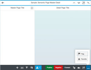
I’m also thinking that the alternative could involve this set of semantic controls. Take a look at the way the Semantic Page Master-Detail sample puts things in the appropriate place – at a semantically meaningful level of abstraction above the individual mechanics of a Page control’s aggregations, for example.
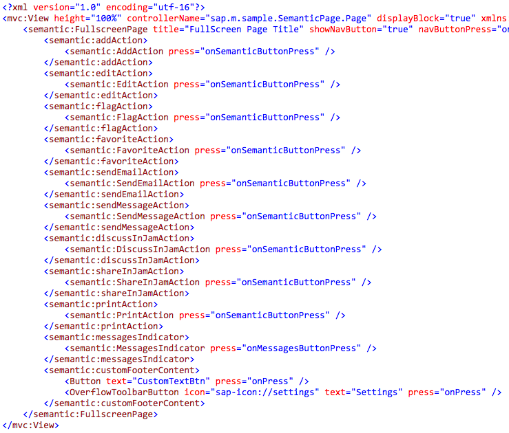
It’s similar in the Semantic Page Full Screen sample too. To get a feel for this level of abstraction, take a look at how the aggregations are filled – nowhere in this XML view definition does it say where the semantic controls should go:
What we seem to have so far is a small hierarchy of Page based controls, that looks like this:
     SemanticPage
          |
    +----------------------+
    |                      |
MasterPage          ShareMenuPage
                           |
                   +---------------+
                   |               |
               DetailPage    FullscreenPage
And there are plenty of semantic controls too. It doesn’t replace the breadth of functionality that the scaffolding offered, but it’s a start, and it feels more modular. A namespace to watch!
- ← Previous
Expression Binding - Next →
Creating Native Applications with UI5