UI5 features for building responsive apps
To build a Fiori app, there are a number of considerations to take into account. One of these considerations is the responsive nature of the app; it should work on different devices (desktops, tablets and smartphones) and act - "respond" - appropriately on each. The UI5 toolkit, with which SAP builds its Fiori apps, has a number of features that help you in this regard. Read on to learn more about what they are.
Introduction
Building responsive apps in UI5 starts with using appropriate controls. The majority of the controls that were created from the ground up to be responsive are to be found in the sap.m library. The "m" in "sap.m" originally stood for "mobile" but now stands for "main", reflecting the key focus on responsive design for the UI5 toolkit.
But using these controls is just the start. Making an app properly responsive means paying close attention to the device capabilities and making design and runtime decisions appropriately. This document outlines some of the main facilities in this regard. The examples are mostly based upon the Explored app in the UI5 SDK.
Split app
The Split App (sap.m.SplitApp) "maintains two NavContainers if runs in tablet and one NavContainer in smartphone. The display of master NavContainer depends on the portrait/landscape of the device and the mode of SplitApp". In other words, it does different things depending on the device.
You can see this in action if you examine the control tree when running on a non-phone and when running on a smartphone.
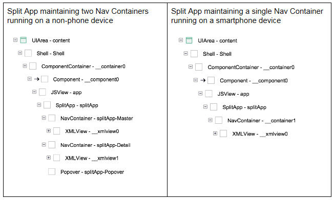
These screenshots are from the UI5 Support tool's control tree display for the Explored app, which uses a Split App control within the view that is returned from the Component's createContent method.
Device model
Often declared on a Component during initialisation (or in the createContent method), this is a client-side (JSON) model with pre-defined boolean values relating to device information returned from the Device API. These values can be used in declarative views to set control visibility depending on the device, for example.
In the Explored app, the device model is declared and set in the Component's createContent method. It is used declaratively, for example, to control whether the Icon Tab Filters are initially expanded or collapsed in the entity view.
Device API
UI5 has a device API which can be queried to find out the device type and more. The API is used to build the values in the Device Model, but also used directly in controller logic. An example of this direct use can be seen in the sample controller.
Grid layout
The Grid mechanism is a control that is found not within the sap.m library, but within the sap.ui.layout library. It "is a layout which positions its child controls in a 12 column flow layout. Its children can be specified to take on a variable amount of columns depending on available screen size".
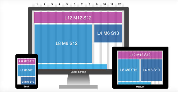
Using the Grid control, and specifying layout data within the layoutData aggregation of each control you place within the Grid, you can define once, for multiple screen size scenarios, a flexible flow based layout that will respond as the screen size alters.
In the Explored app, the Grid - Tile-based Layout sample shows how the Grid works. A number of tiles (in the form of Object List Item controls) are defined within the Grid. Each of them has layout data specified either via the Grid's defaultSpan property or specifically with the span property of an aggregated GridData control. This layout data specifies how many of the 12 columns a control should span, in large (L), medium (M) and small (S) screen circumstances.
In the sample referenced above, the smaller tiles have layout data of "L4 M6 S6", meaning that on a large screen each will span 4 columns (meaning there will be three on any given row), otherwise they'll span 6 columns (meaning there will be two on any given row). The larger tiles (the "Deskjet Super Highspeed" and the "Power Projector 4713" in the screenshots below) have layout data of "L6 M12 M12", meaning that on a large screen each will span 6 columns (two on any given row) and on medium and small screens each will span 12 columns (one on any given row). You can see the effect here:
For more information on the 12 column grid, see Johannes Osterhoff's post Responsive Web Design.
Control visibility
In many cases, simply turning off the display of a control, or part of a control, is all that's needed to improve the way an app is displayed on different sized devices. Controls inherit from sap.ui.core.Control which has a visible property. With this, you can turn off the display of pretty much any control programmatically.
One technique is to do this imperatively, in a controller function, depending on circumstances. Alternatively, and this is often used in conjunction with properties in the Device Model, you can do it declaratively, in the view definitions. An example of this is for the navButton of a Page control that is aggregated (via a View) into the detailPages of the Explored app's Split App.
The Page in question is the "Not Found" page, shown when (usually via direct URL manipulation) the specified control cannot be found:
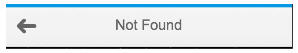
The navButton is the left-arrow shown here. When running on a desktop or tablet, there's no need to display a navButton to navigate back to the master, as the master is still on show (the Split App is displaying it in the left hand third of the screen). But on a smartphone, with a single Nav Container, only either a detail page or a master page is shown, meaning that some sort of button is required to navigate back to the master if a detail page is shown.
This is achieved by binding the value for the Page control's showNavButton property, which is to be a boolean, to the (boolean) value of the isPhone property of our Device Model, which, by dint of the value derived from the Device API, will cause the navButton to be shown on a smartphone but not on a desktop or tablet. You can see this in the notFound.view.xml definition.
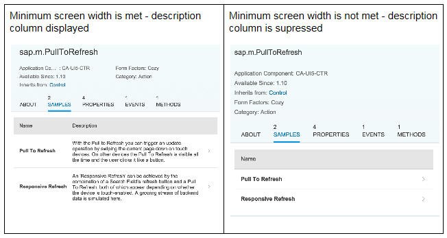
Minimum screen width
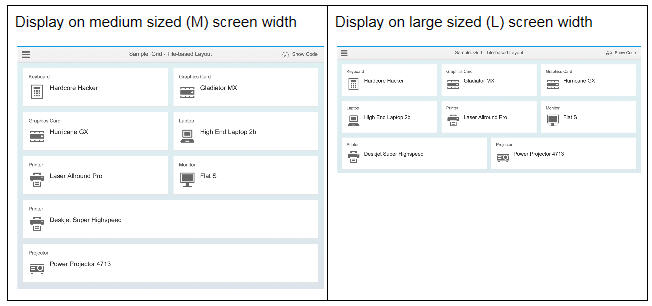
When designing responsive Table controls, each Column control can be declared with a minimum screen width that is required have the values in that column. If the minimum width is not met, the column is not displayed.
In the Explored app, the Description column in the Samples Icon Tab Filter is subject to a minScreenWidth value of "Tablet" (a pre-defined device size), below which it is not displayed. Here we can see the display with and without the column:
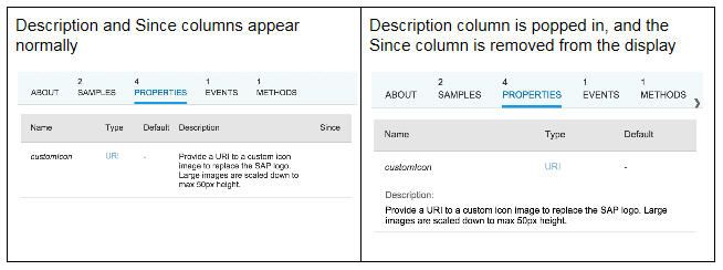
Popin columns
Instead of the display of a column being simply supressed, it can be "popped in" instead. This means that it will be displayed underneath the rest of the columns, still within the logical row / record display. The popin behaviour will kick in if the minimum screen width for a Column is not met.
In the Explored app, a control's properties are displayed in a "Properties" Icon Tab Filter. Two Column controls in the Table have values specified for the demandPopin property - those for Description and Since. If the restricted width requires, the Description column will be popped in (demandPopin="true"), and the Since column will disappear (demandPopin="false"):
With the related Column property popinDisplay you can control how the popped in column should appear.
Factories
Sometimes a declarative approach to handling responsive design isn't enough, and you need to fork the design depending on what device the app is running on. An example of where you might want to do this is in the display of items in a list. On a device with enough screen real estate you might want to use an Object List Item as a template for each item. Used on a smartphone, this control will mean that you may only get a small number of items displayed before you have to scroll. More appropriate might be a control that takes up less vertical space, such as a Standard List Item.
Instead of a template, you can use a specify a factory function in the aggregation binding of a control. You can then implement this factory function to use the Device API to determine the current device type, and dynamically return the control appropriate for that device.
While the Explored app doesn't use factory functions, there is an example in the upcoming OpenUI5 Course that shows how they're used. In Episode 6 "Custom Sorting, Factory Functions and XML Fragments", a factory function is used to return a different item template depending on the category of the item in the data. The reference to this factory function is made declaratively in the embedded binding of the List control's items aggregation.
Pre-defined device sizes
When specifying screen sizes for the minScreenWidth property, for example, you can use various standard CSS size references. There is also, however, a Screen Size enumeration which abstracts some standard sizes away for you. It is one of these enumerations - Tablet - that is used throughout the Explored app's entity view declaration.
Summary
As you can see, the responsive features and facilities offered by the UI5 toolkit are many and varied, but at the end of the day it is up to you as a designer and / or developer to wield these features in the most appropriate way possible, to implement your responsive Fiori apps.
Share and enjoy!