Handling Dates with the Date Picker
30 Days of UI5 - day 10 by James Hale.
(Get to all the parts in this series via the series post.)
When creating applications, the experiences of the user should be one of the key considerations that drives build and development. One aspect of this is the way that data is entered, saved and displayed to the user, which can drastically affect the usability of an application.
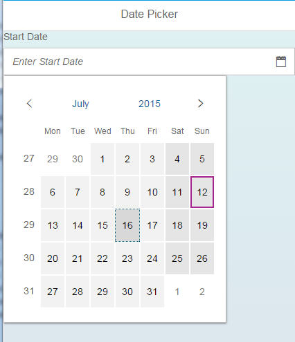
For this short post, we’re going to take a look at the Date Picker, which is an input control in the OpenUI5 library used for simple capture of dates from the user. As we all know, dates can be somewhat of a nuisance to work with, especially when entering on small screens with particular formats. This control aims to ease this with a calendar style view of dates to select from.
It’s a simple, yet effective, little control that allows users to quickly select dates with a familiar and quick to use calendar style view. The control is also configurable to display different date formats based upon the displayFormat property, which can be useful when screen real estate is at a premium.
By using controls like the Date Picker with dedicated input mechanisms, we can all aim to make our applications easier to use within the day to day lives of users.
For additional controls focussed around date and time input, take a look at the Date Range Selection control when working with time periods, as well as the Date Time Input when making forms that handle dates and times together.
- ← Previous
Bootstrapping UI5 Locally and in the Cloud - Next →
Base Classes in UI5