Mobile Dev Course W3U3 Rewrite - XML Views - An Intro
I rewrote the mobile dev course sample app from W3U3. Then I created a new branch 'xmlviews' in the repo on Github and rebuilt the views in XML (they were originally in JavaScript). This post talks about XML views, and touches on some points that might be useful for you if you're looking to build SAPUI5 apps with XML views yourself. See the links at the bottom of the opening post of this series to get to explanations for the other areas.
Different Ways To Define a View
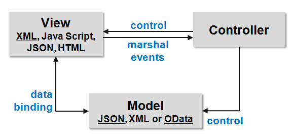
To understand where XML views fit in, let's take a look at this diagram that highlights the Model-View-Controller (MVC) support that SAPUI5 has.

Views can be written in JavaScript, HTML, JSON or XML.
- HTML: The Wave 1 Fiori apps are written in HTML (and may be re-written to be in XML)
- JavaScript: Many of us start out writing views in JavaScript, partially because there are a lot of examples out there in JavaScript (that's changing soon with the sap.m Explored app in the DemoKit - watch this space!) and partially because it's the same language we use to build the controllers
- JSON: You can build views declaratively with JSON; it's not common to see, but intriguing nonetheless, especially when you consider building views programmatically
- XML: Fiori Wave 2 apps are built with XML views
Recently I've had a good chunk of work that involved writing XML views, and I can honestly say that in contrast to the received wisdom that has XML as "generally verbose and clunky", writing views in XML is both concise and very pleasant, not to mention satisfyingly declarative.
A Simple View in XML and JavaScript
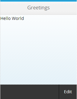
Let's get an idea of what an XML view looks like, and contrast it with the JavaScript equivalent. We'll keep it deliberately simple - this is what it looks like:

We're using the sap.m library controls: An App, containing a Page, which has a Text as the only main content, and a Bar, containing a Button, as the footer.
This is what the view looks like declared in XML.
<core:View xmlns:core="sap.ui.core" xmlns="sap.m">
     <App>
        <Page title="Greetings">
            <Text text="Hello World" />
            <footer>
                <Bar>
                    <contentRight>
                        <Button text="Edit" />
                    </contentRight>
                </Bar>
            </footer>
        </Page>
    </App>
 </core:View>
And this is what it looks like declared in JavaScript. Note that I've deliberately avoided any unnecessary verbosity by not declaring intermediate variables to hold the different controls, as is common in many examples.
sap.ui.jsview("com.opensap.Page", {
    createContent: function(oController) {
        return new sap.m.App({
            pages: [
                new sap.m.Page({
                    title: "Greetings",
                    content: [
                        new sap.m.Text({
                            text: "Hello World"
                        })
                    ],
                    footer: new sap.m.Bar({
                        contentRight: new sap.m.Button({
                            text: "Edit"
                        })
                    })
                })
            ]
        });
    }
})
Now, this is not a competition between the two, but I know which I prefer. The XML view is simpler to scan and it's clearer to see what controls are being used, and what relation they have to each other. It's also slightly less verbose than the JavaScript view. This conciseness is accentuated with larger views - the concise nature of the declarative syntax remains and scales in XML.
The Nature of an XML View
XML Namespaces
Let's have a look in a bit more detail at that XML view. Notice first that there are namespace definitions. This is standard XML stuff, and affords us prefixes to specify from what SAPUI5 library the specific control is from. Here we have a couple of prefix namespaces - "core", for the sap.ui.core library, and the default namespace (no prefix) for the sap.m library. It makes sense in this case (and for the Fiori apps) to have the default namespace set for sap.m as that's where the majority of the controls come from, and therefore the majority of the XML element names won't need a prefix. Note the "core" prefix is used on the root element itself: "core:View".
Representing Controls
Once we've declared our namespaces, we're ready to declare the controls that we want to use. And for the App control, for example, it's as simple as an opening and closing element pair: "
Note that the controls we mentioned are represented by XML elements that are capitalised (View, App, Page, Text, Bar, Button).
Digging Into Controls
But what about the other stuff? What's that "
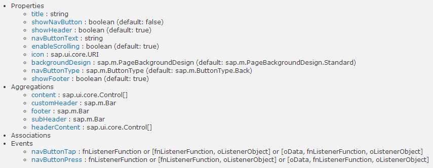
", for example? That's not a control, nor is it capitalised. It's an aggregation. Specifically, an aggregation belonging to the Page control.Let's take a step back and look at how controls are structured. We'll take the sap.m.Page control as an example. This is what we see when we look at the sap.m.Page control's constructor documentation in the API reference:

We see that a control can have Properties, Aggregations, Associations and Events. In this example, what we're interested in are Properties and Aggregations. By now you will probably have worked out that Properties of a control are declared using XML attributes (title="Greetings", for example). And as properties don't start with an uppercase letter, neither do the corresponding attribute names.
So that brings us on to Aggregations. An aggregation can be thought of as a collection of zero or more 'child controls'. Perhaps one of the most common aggregations is in a sap.m.List control, where the entries in the list are, say, sap.m.StandardListItem control children in the 'items' aggregation. Note that in the aggregation definition, the type of controls that can be contained can be restricted. In the case of the List's items aggregation, the type sap.m.ListItemBase is specified:

As sap.m.StandardListItem inherits from sap.m.ListItemBase, it is a valid control to be contained in the sap.m.List's items aggregation.
So, back to "<footer>…</footer>". Guess what? Yes, this XML element, with a lower case initial letter, represents an aggregation. You can see from the documentation screenshot that the footer aggregation of the sap.m.Page control expects a single control - a sap.m.Bar. So that's what we have - a Bar. And in turn, the sap.m.Bar control has a triple of aggregations, representing content in the left, center and right of the Bar. In this case we want to put a sap.m.Button control on the right, so we use the contentRight aggregation. And the simplicity of what we want to do is in some part reflected in the simplicity of the XML:
        <Page title="Greetings">
            <Text text="Hello World" />
            <footer>
                <Bar>
                    <contentRight>
                        <Button text="Edit" />
                    </contentRight>
                </Bar>
            </footer>
        </Page>
But wait. In the JavaScript version the sap.m.Text control is specified within the content aggregation of the sap.m.Page:
                new sap.m.Page({
                    title: "Greetings",
                    content: [
                        new sap.m.Text({
                            text: "Hello World"
                        })
                    ],
Where's the equivalent in the XML? There isn't. Or rather, it's implicit. The content aggregation is the Page's default aggregation, and as such, doesn't need to be explicitly declared in the XML view. Clean! You can include the "<content> … </content>" if you want:
        <Page title="Greetings">
            <content>
                <Text text="Hello World" />
            </content>
            <footer>
                <Bar>
                    <contentRight>
                        <Button text="Edit" />
                    </contentRight>
                </Bar>
            </footer>
        </Page>
but you don't have to.
Next Steps
Armed with this knowledge, we're ready to examine the XML versions of the views in the W3U3 app I rewrote. We'll do that in the next post.
Until then, share & enjoy!